Responsive images are a key to page load performance. If a page contains one or multiple images, they will make the majority of the request payload. For this reason, downloading only what is strictly necessary, e.g. a low resolution image for small displays and a high resolution one for bigger displays will significantly improve the loading time of a page.
There is more than one way in which we can implement responsive images, and each way is best suited for a specific use case. We are going to show which of those ways are and what the best use case is.
CSS Background
The easiest way to implement responsive images is to use the background-image property in CSS. Setting the background using CSS allows us to use breakpoints to change the images, as shown in the following snippet:
1.background {
2  background-image: url("/images/image-small.jpg");
3}
4
5@media only screen and (min-width: 400px){
6  .background{
7    background-image: url("/images/image-medium.jpg");
8  }
9}
10
11@media only screen and (min-width: 500px){
12  .background{
13    background-image: url("/images/image-large.jpg");
14  }
15}
16
This approach, however, has a major disadvantage: it makes the Largest Contentful Paint (LCP) slower. This happens because, during the page load, first the HTML is downloaded and parsed, then the CSS, and only then the images are fetched.
Src Set
To make the LCP faster, we can move the image from the CSS into the HTML, and provide more than one image for the img tag using the srcset attribute, thus keeping the responsive behaviour:
1<img src="" srcset="" />
2
Note: Always provide an src. If the browser doesn't support the srcset feature, it's going to use the src image as a fallback.
This approach significantly improves performance since the images are now immediately fetched after the HTML is parsed, instead of being fetched after parsing both HTML and CSS.
We can tell the browser which image to pick in two different ways:
Depending on the device pixel ratio
This approach is the best when we don't have specific size needs and we are only interested in having the best image for the current screen resolution.
1<img src="/images/image@2x.png" srcset="/images/image@1x.png 1x, /images/image@2x.png 2x" />
2
This way, the browser checks the device's pixel ratio and automatically picks the most appropriate image size.
Depending on the size
This way allows us to specify at which screen size we want the image to change, giving us a finer control on which image is displayed.
1<img
2  src="/images/image-large.jpg"
3  sizes="(max-width: 300px) 300px, (max-width: 400px) 400px, (max-width: 500px) 500px"
4  srcset="/images/image-small.jpg 300w, /images/image-medium.jpg 400w, /images/image-large.jpg 500w"
5/>
6
Here the srcset defines the images and their sizes, while the sizes attribute is in the form media_query image_size, where the media query defines the condition for which we pick an image, and the image size defines the size of the image we want to pick.
The browser will look at the sizes property, evaluate the media queries, get what is the right image size, and then look in the srcset for an image with that size. If it can't find any, it will use the src fallback, and if a src fallback is not present, it's going to use the largest image.
Note: All the sizes specified in sizes and srcset assume a device pixel ratio (DPR) of 1. If we have a max-width: 300px media query and a display with a DPR of 2, then the image is going to change already at 150px, and not at 300px (150px * 2 = 300px).
Differences between browsers
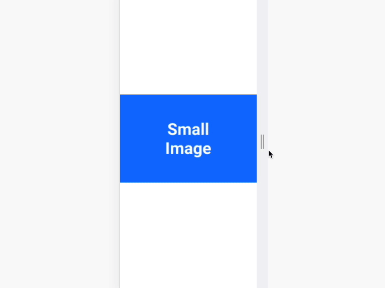
The srcset, however, also has a major drawback. In Chrome for example, if we resize the browser from small to large, the larger image will be fetched and used, but if we resize from large to small the browser will keep using the larger image, because of its higher resolution. Here is an example:
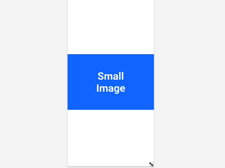
This behaviour is different in Firefox. The browser will always show the image that matches the specified media queries:
Thus, the srcSet approach is feasible only if the image is equal across the different sizes in content, and different just in the resolution.
Picture tag
If we want to display completely different images depending on screen sizes and also avoid using CSS, the <picture> tag comes in handy:
1<picture>
2  <source media="" srcSet="">
3  <img src="" srcSet="" alt="" />
4</picture>
5
It allows us to define different sources for different screen sizes and a srcSet for each source. This means that we can have different images depending on the screen size, and then have different resolutions for the same image.
Example:
1<picture>
2  <source
3    media="(max-width: 300px)"
4    srcSet="/images/image-small@1.jpg 1x, /images/image-small@2.jpg 2x">
5  <source
6    media="(max-width: 400px)"
7    srcSet="/images/image-medium@1.jpg 1x, /images/image-medium@2.jpg 2x">
8  <img src="/images/image-large@2x.jpg" srcSet="/images/image-large@1.jpg 1x, /images/image-large@2.jpg 2x" alt="" />
9</picture>
10
The browser will try to find the best match between the sources evaluating the media query in media, and if it can't find any, or if it doesn't support the feature, the <img> tag is used as a fallback.
Note: The <img> tag is used for the rendering and not only as a fallback, meaning that it is required for the <picture> tag to work. Also, the src attribute will not work with the <source> tag when used inside <picture>, always use the srcset attribute.
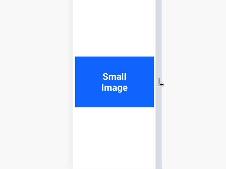
The behaviour here is different from the srcset approach as you can see here:
Conclusion
The three methods that exist to implement responsive images are: CSS, srcset and <picture/>. If you care the most about performance, srcset will be the best choice, but if you need finer control on which image you want to show at which screen size, <picture/> is the best approach.