
Designing consistent and clear user interfaces is a key responsibility for any UI designer. To make this task easier, Figma offers the ability to create your own custom components. Components are reusable parts of a UI design that can be used to improve consistency and efficiency. In this guide, we'll learn how to create a customizable button component in Figma. Working with components gives you a variety of benefits which will help to improve your designs. Let's see some of them:
-
Consistency for your design: By creating a component and reusing it throughout your design, you can ensure that your buttons, for example, have a consistent look and feel.
-
Design quicker with higher quality: Components allow you to design faster and more efficiently, as you can reuse elements instead of recreating them each time. This can also help you produce higher quality designs, as you can focus on refining a single component rather than starting from scratch each time.
-
Start thinking like a developer: Components can also help you start thinking like a developer, as they encourage you to break down your design into smaller, reusable pieces that can be easily integrated into a larger system.
Now that we've discussed the benefits of using components in Figma, let's start building our button component.
1. Create the base of your button
To create the base of your button, use the text tool to write the word "Button". Then, use the menu Object > Add Auto Layout or use the shortcut Shift + A to add Auto-layout to your text.
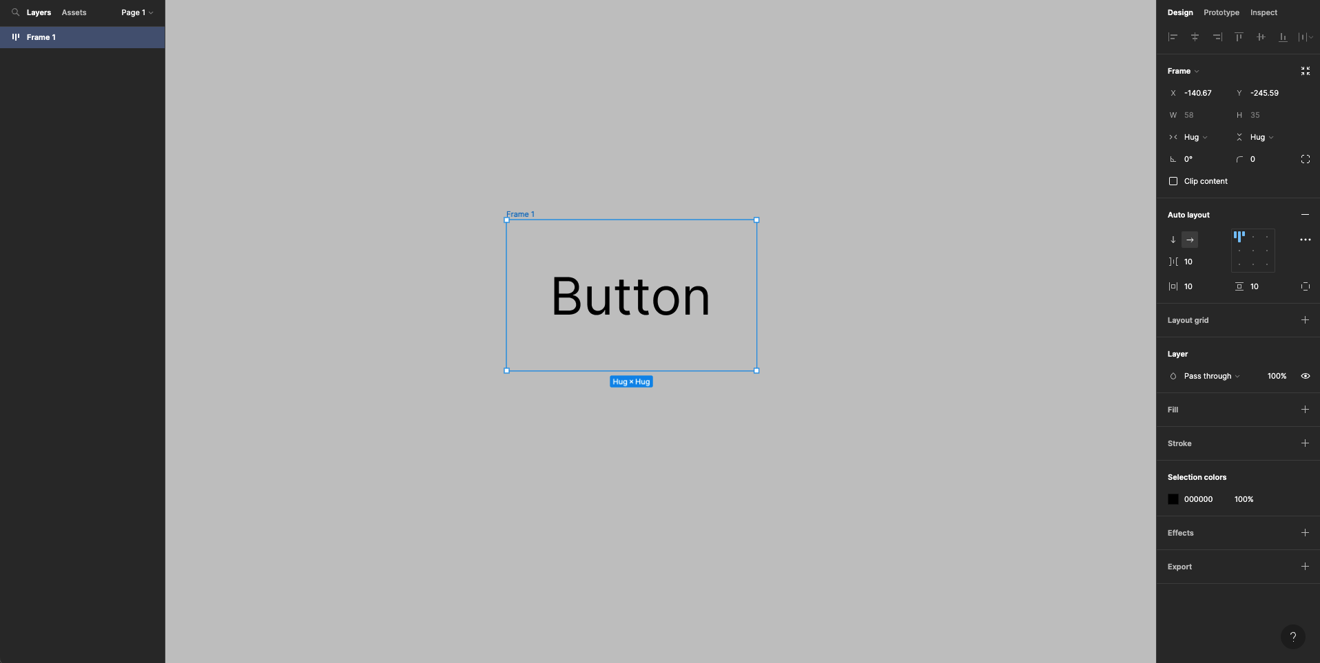
This will transform the text into a frame with some default padding. You can then add a fill to your button to complete the basic design.
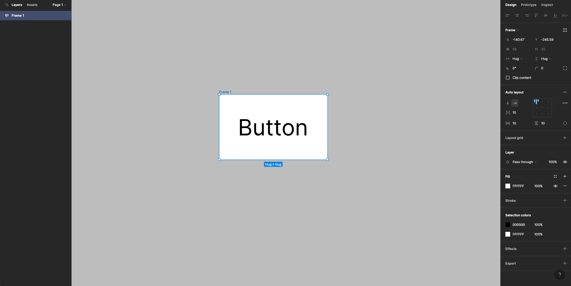
2. Autolayout & resizing
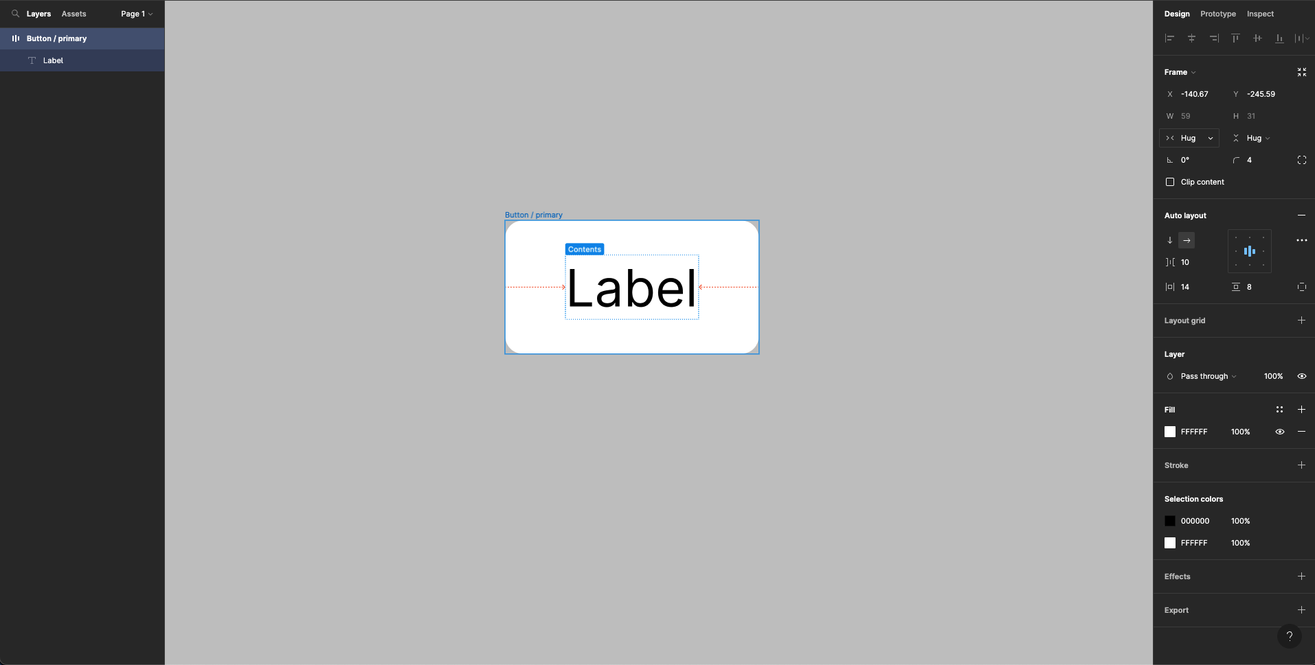
Adjust the padding for your button using the Autolayout and resizing options in the right sidebar. Make sure the alignment is set to centre and the width and height resizing is set to Hug. Make the width larger than the height in order to have a clean balance of white-space for your button. You can also add some border radius to give your button a smoother appearance. Rename your frame to "Button / primary" and the button text to "Label".
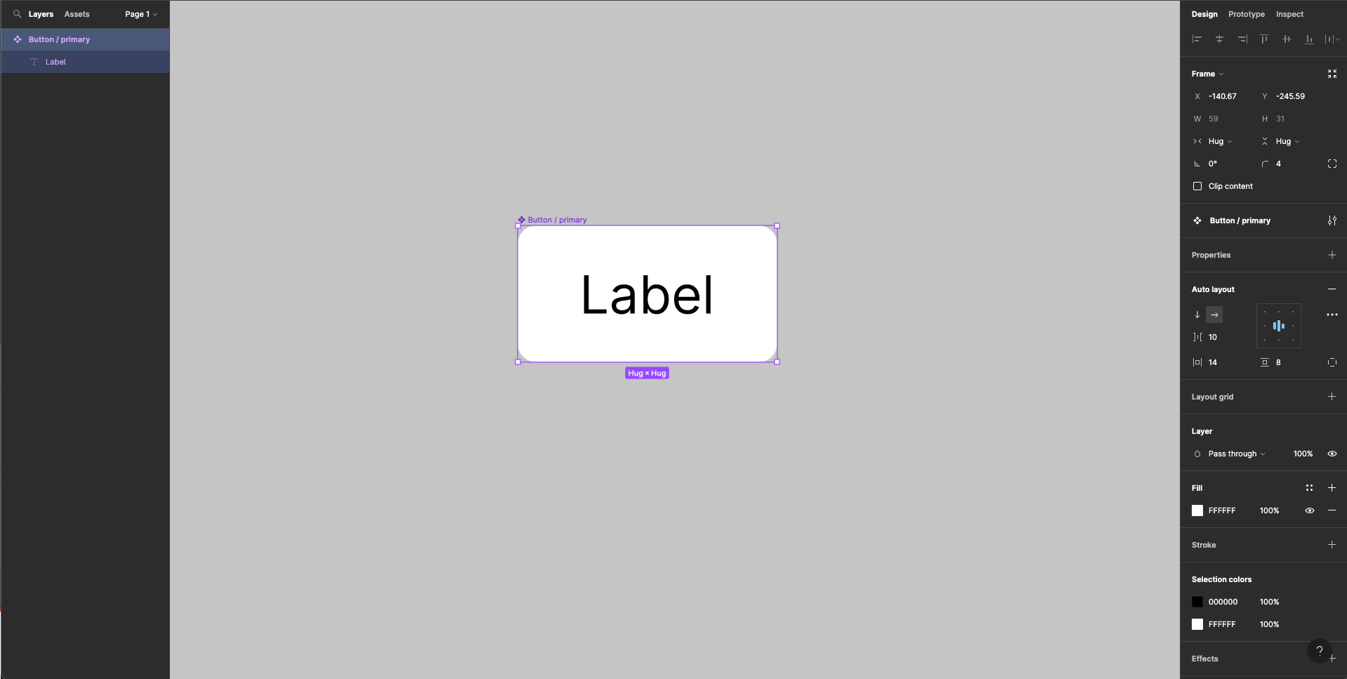
3. Create a component from your base
To turn your button into a component, click in the menu on Object > Create Component or use the shortcut Command + Control + K. If the border of your frame changes colour to violet, the component has been created successfully.
In the Properties section of the right control panel, you can add different variants to your component by pressing the plus icon. For this scenario, we'll create the following variants: "Solid," "Ghost," and "Soft."
You can add as many variants to your component as you need. As mentioned earlier, we are going to create three variants and name them properly.
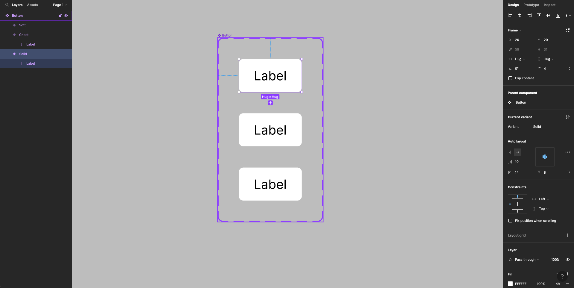
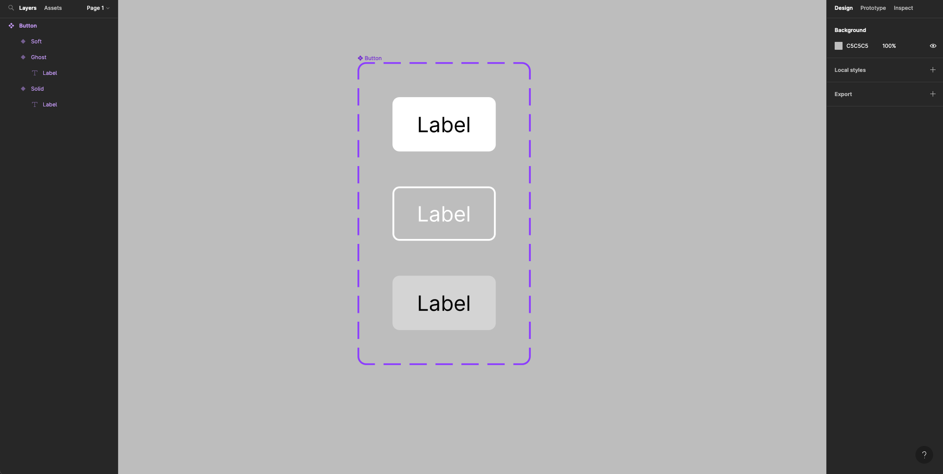
Change the style of the built variants to have the appearances as you need them. You can repeat this action to create different tones and/or different states of your button (ex.: hover, active, disabled, enabled etc.). Always remember to apply the right styles to the right variant property.
4. Use your new button component
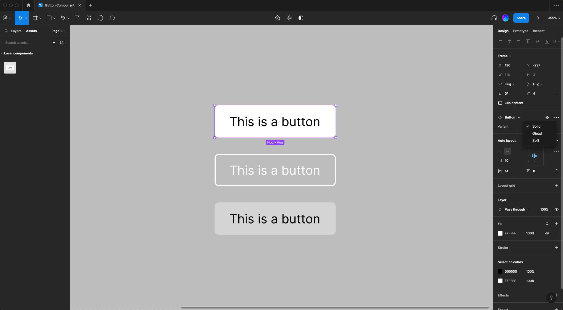
Once you've finished designing your variants, you can find your component in the Assets menu on the left sidebar.
You can drag the component onto your artboard and change its variant using the right side panel. This allows you to create consistent and dynamic designs, even for complex projects.
Designing with components can significantly improve the way you approach projects and helps bridge the gap between designers and developers. If you're working on a particularly complex component, you may want to consider breaking it down into smaller components. For example, if you want to create a list component, you could create separate list header and list item components. These smaller components can then be combined to create the final list component.
5. Conclusion
Using components in Figma can provide a number of benefits, including improved consistency, faster and more efficient design, and a better understanding of how to design for developers. By following the steps outlined in this tutorial, you can create your own customizable button component and start using components in your designs. Experiment with different components and you'll quickly see the value they bring to your designs.