
In an era where digital transformation dictates the pace of industries, AboutBits undertook a rebranding journey to modernize its visual identity and strengthen its brand positioning. The new identity is not just a facelift but a reflection of the agency's growth, commitment to excellence, and the digital craftsmanship it embodies.
The Logo: Inspired by Digital Precision
At the heart of the rebrand is the meticulously crafted logo and its supporting claim, “Crafting digital products.” This phrase encapsulates AboutBits' ethos: delivering custom-tailored software solutions that are as precise as they are innovative. Every solution the agency provides is meticulously crafted—handmade to fit the unique needs of its clients, much like an artisan approaches their craft. The claim reinforces the brand’s dedication to combining expertise, creativity, and attention to detail in every project.
The logo itself integrates a monogram and a wordmark, designed to function independently or as a cohesive unit. Rooted in the concept of "bits"—the fundamental building blocks of digital technology—the logo embodies precision and simplicity. The structured design is further enhanced by a grid system, with proportions derived from a "Bits-Element." This ensures a harmonious layout, scalable across diverse formats and responsive for horizontal and vertical applications. This structured foundation emphasizes the agency’s dedication to order, clarity, and a pixel-perfect approach.
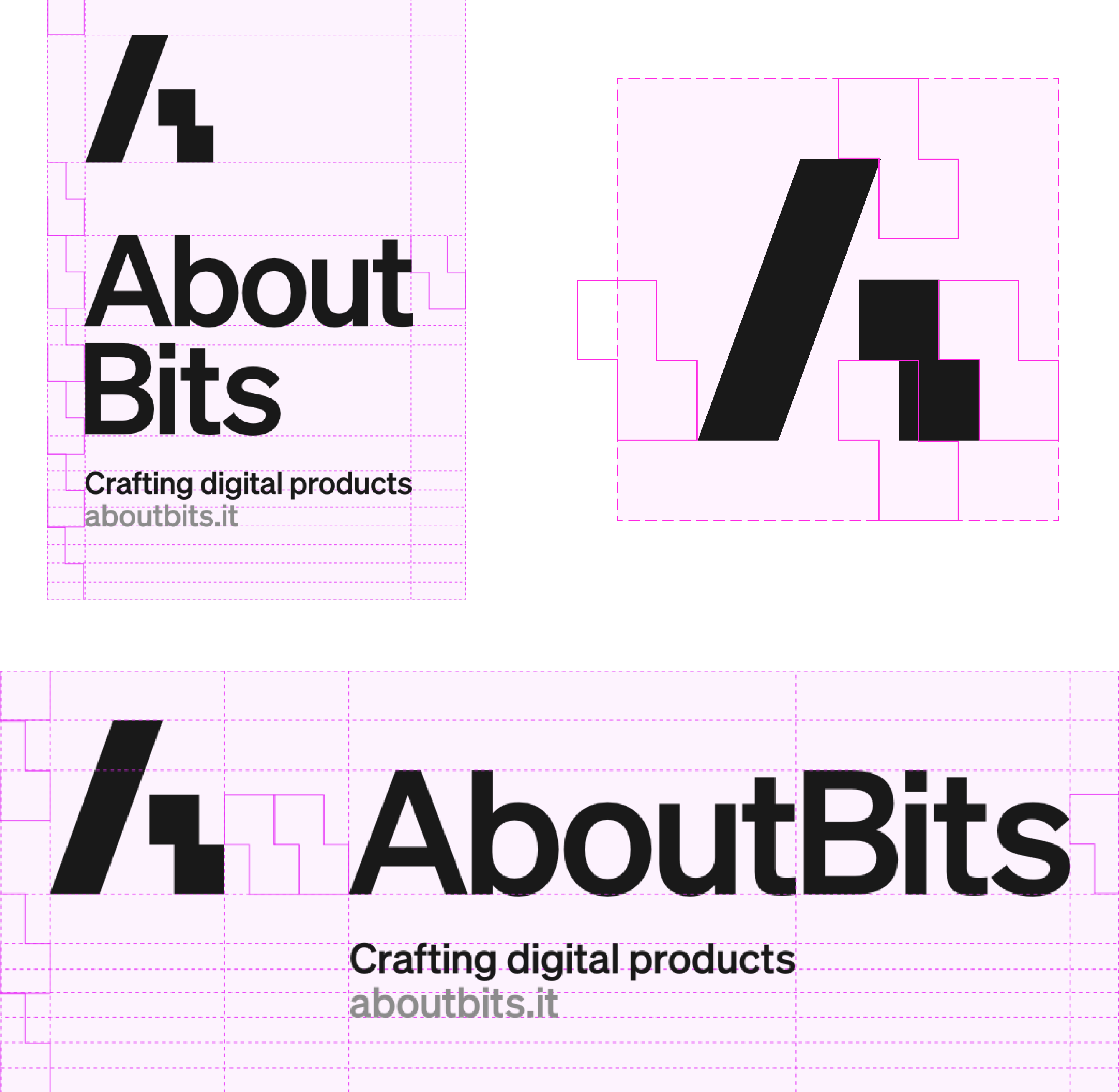
The structured design is further enhanced by a grid system, with proportions derived from a "Bits-Element." This ensures a harmonious layout, scalable across diverse formats and responsive for horizontal and vertical applications. This structured foundation emphasizes the agency’s dedication to order, clarity, and a pixel-perfect approach.
The Palette: Contrasts That Build Harmony
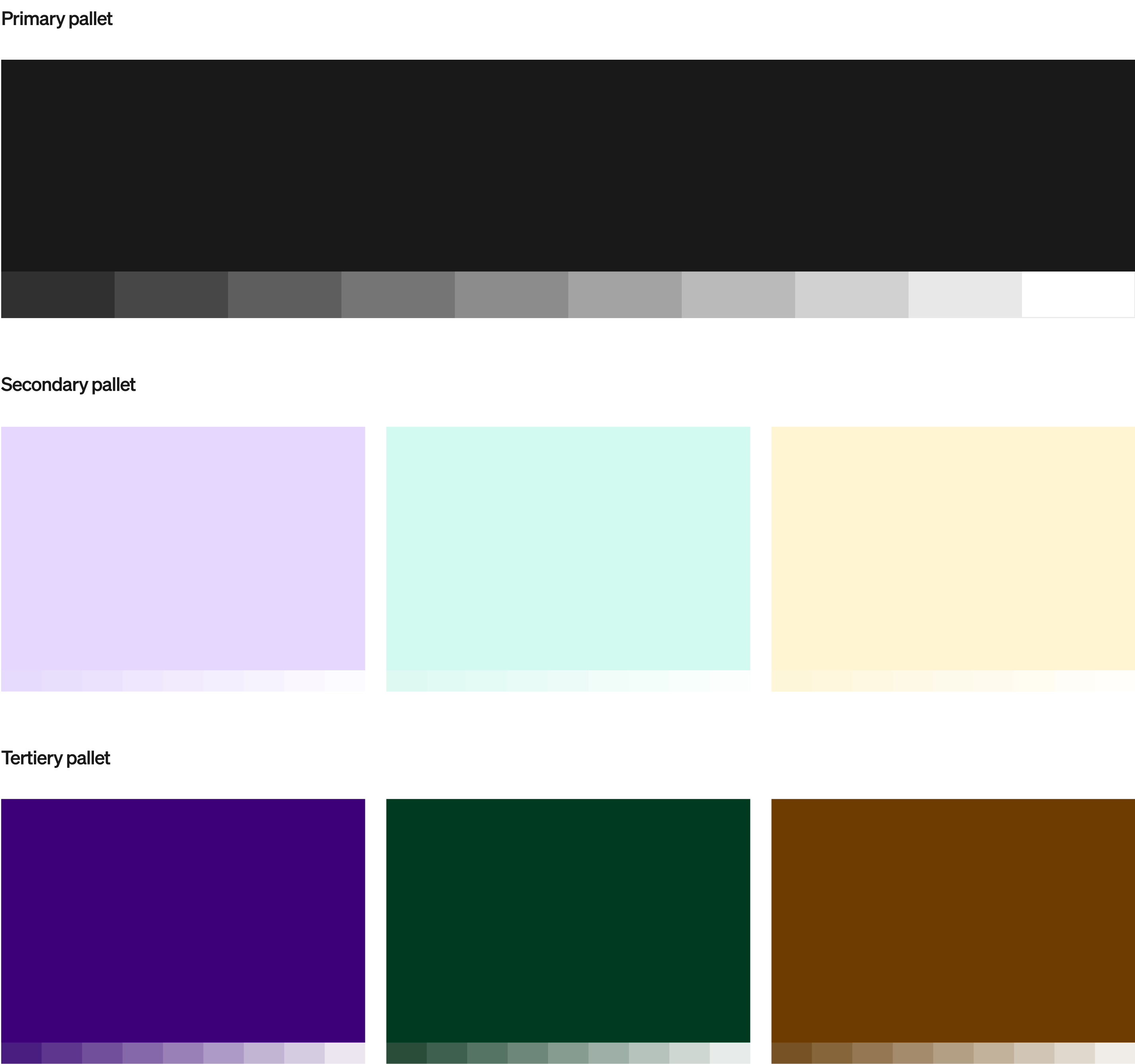
The AboutBits color palette is a cornerstone of its new visual language. Divided into primary, secondary, and tertiary colors, each plays a specific role in ensuring versatility and clarity.
- Primary: A bold dark gray serves as the brand’s anchor, providing a neutral yet strong base.
- Secondary & Tertiary: The secondary palette features light, vibrant tones—lavender, mint, and yellow—that convey freshness and approachability. The tertiary palette, with deeper hues of violet, green, and brown, adds sophistication and depth.
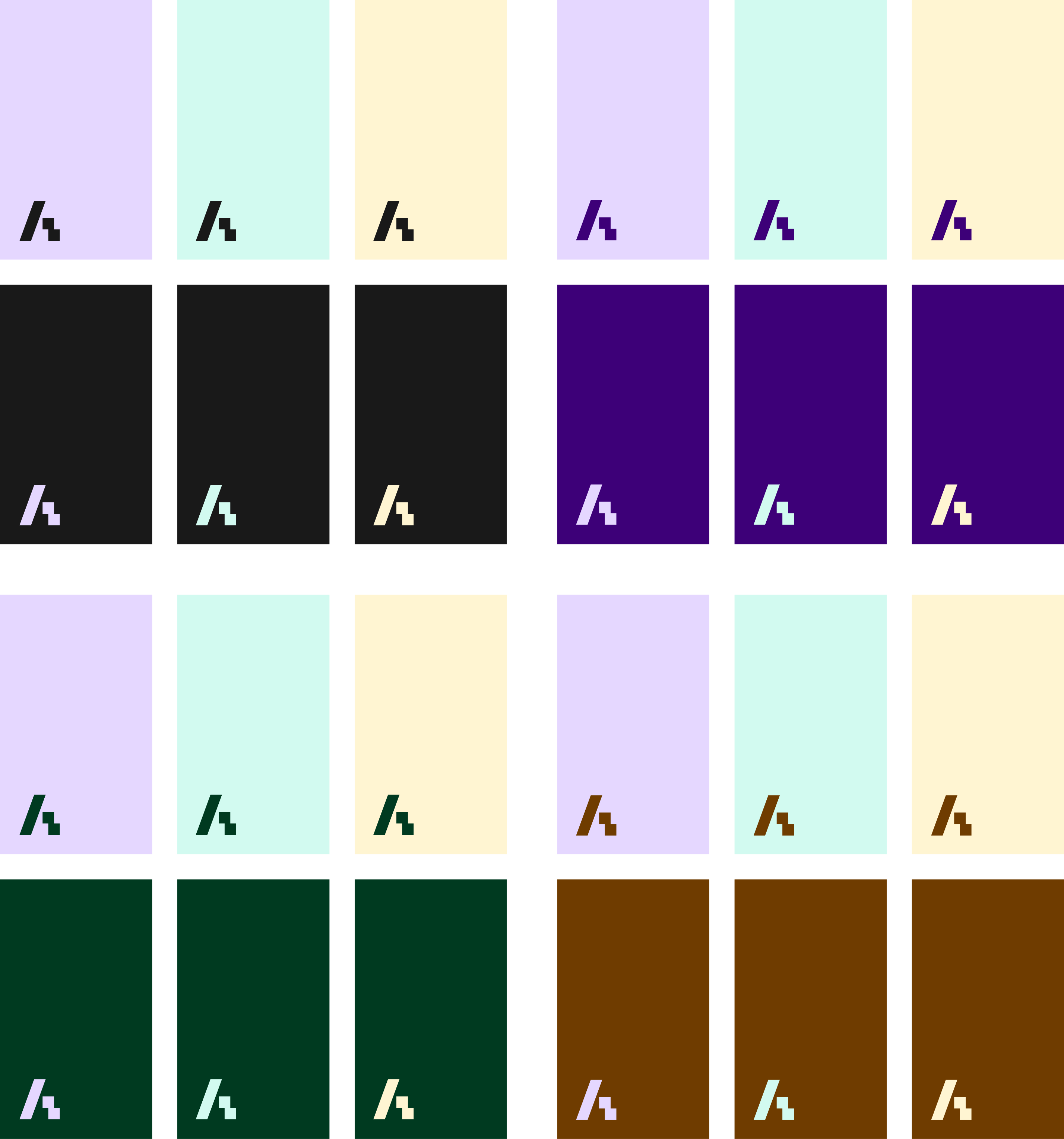
The guideline ensures contrast and harmony by allowing secondary and tertiary colors to interact freely—a secondary color can be paired with any tertiary color and vice versa. However, combinations like secondary-on-secondary or tertiary-on-tertiary are avoided to maintain a balanced visual experience. This rule reinforces the brand’s commitment to clarity and modern aesthetics.
Imagery: Dual-Tone Creativity
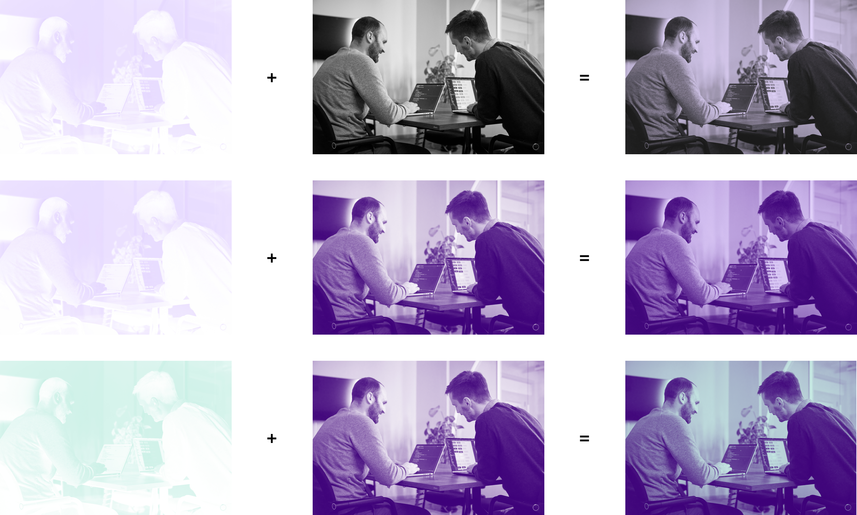
Imagery plays a vital role in AboutBits' brand storytelling. Photos and visuals utilize the primary gray tone in a classic duo-tone approach, ensuring cohesion across materials. More creatively, duo-tones can also be constructed by combining a secondary and a tertiary color, adhering to the contrast rule established in the palette guidelines. This innovative use of color amplifies the brand’s unique identity while allowing flexibility in visuals—from photographs to graphic illustrations.
Portraits, product displays, and abstract imagery are unified under this rule, enabling consistent yet creative visual storytelling across all media.
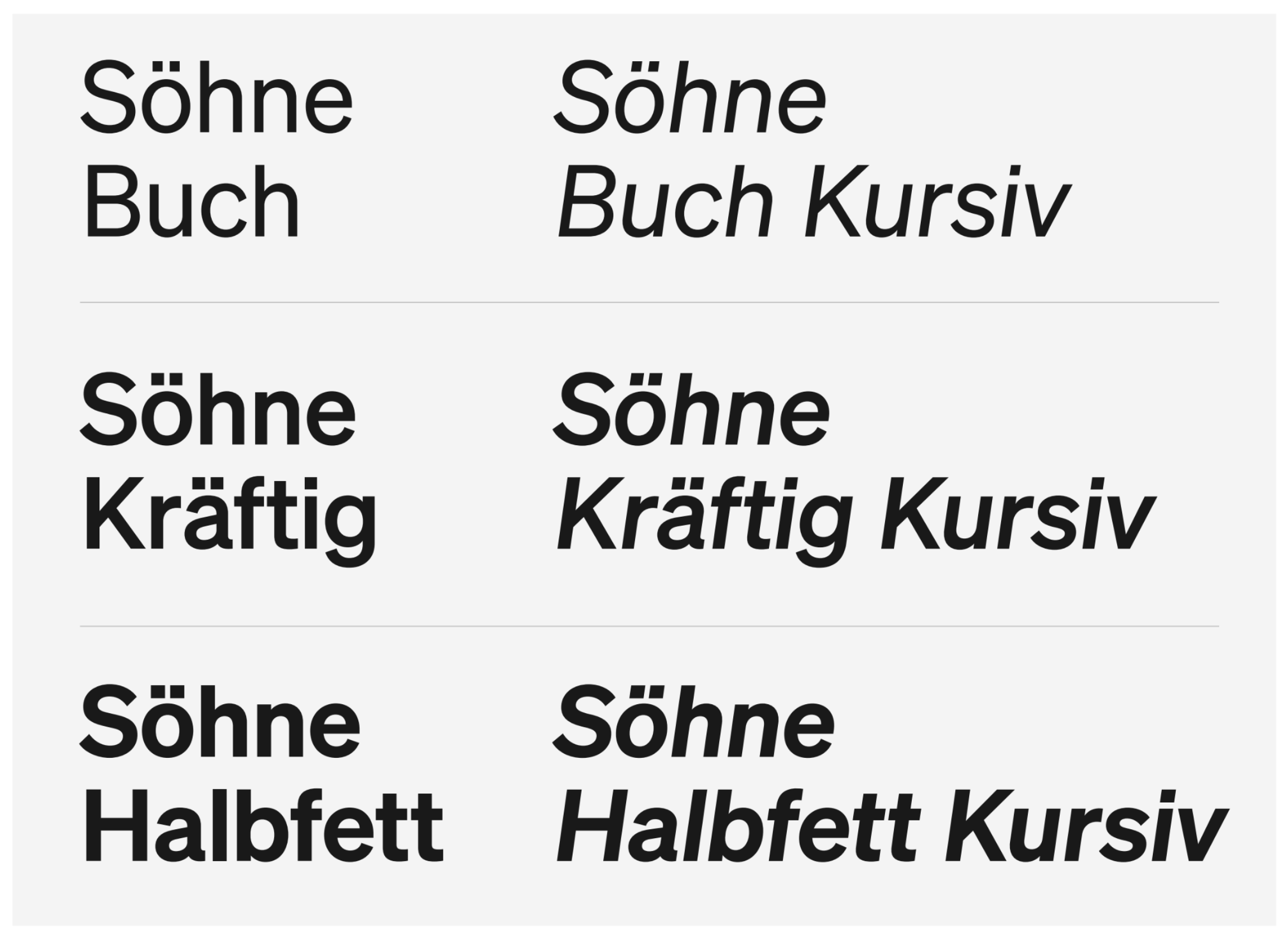
Typography: Söhne from Klim Type Foundry
The choice of Söhne, a typeface from Klim Type Foundry, underscores the brand's emphasis on clarity and modernity. Available in weights such as "Book," "Semi-Bold," and "Bold," Söhne is versatile, ensuring optimal readability for both print and digital applications. Its minimalist yet strong character aligns seamlessly with AboutBits’ mission to deliver precise, high-quality digital solutions.
- Primary usage: Bold weights are predominantly used for headlines, giving the brand a confident voice.
- Supportive usage: Lighter weights like "Book" add elegance and legibility to longer texts, while semi-bold weights emphasize key information.
This thoughtful typography selection reinforces the brand's professional and approachable tone.
Applications: Bringing the Brand to Life
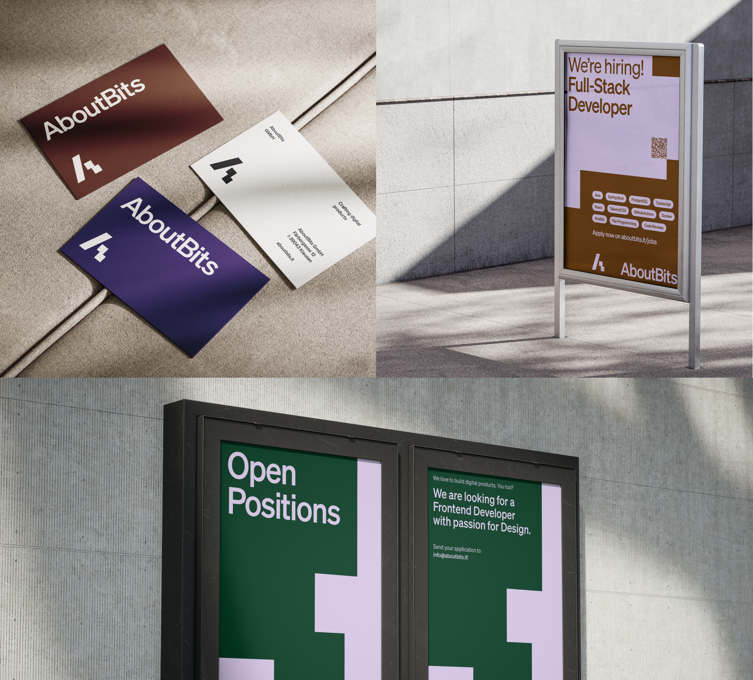
The rebranding comes to life through a variety of creative applications, showcasing AboutBits’ attention to detail and adaptability. From recruitment materials to promotional designs, each touchpoint reflects the rebrand’s precision and vibrancy. The grid system allows flexibility while maintaining consistency, offering a dynamic framework for both bold and understated layouts.
Imagery and color usage are seamlessly integrated into these designs. Whether it’s a recruitment poster using a secondary and tertiary duo-tone or a client presentation emphasizing clean typography and a striking color combination, the rebrand delivers a compelling and cohesive visual identity.
Through this rebranding, AboutBits has not only modernized its image but also created a visual language that is as innovative and adaptable as the solutions it offers. The thoughtful integration of logo design, color, imagery, and typography communicates a clear message: AboutBits is at the forefront of crafting digital excellence.