
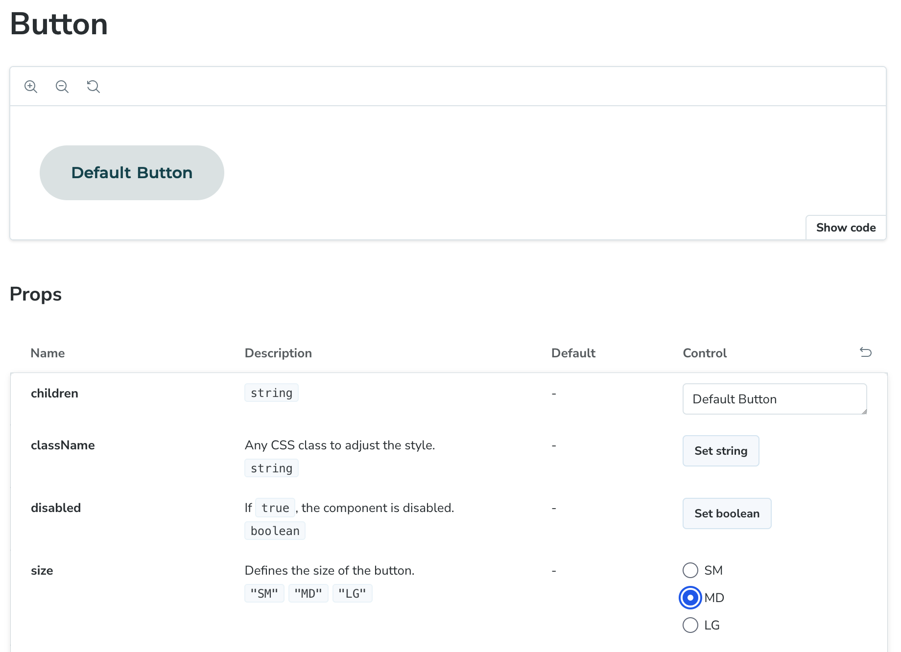
When developing a frontend component library, it’s common to start with simple properties for components, such as defining the size of a button. For this, you can define a limited set of values that a developer can pass to the component, like SM, MD, or LG As a component library maintainer, you’re responsible for supporting these sizes, and you handle the appropriate styling for each size.
However, as the underlying design system evolves, and as new components are added—especially compound components that combine other components (e.g., a dialog containing buttons) — the complexity of the system increases. New challenges begin to emerge.
One key challenge we encountered was handling responsive props. In the early stages, simple component props like button sizes work well. However, as you move towards developing compound components (like dialogs), the need arises to allow developers to define not only a single value for a property but also different values for different screen sizes.
A Real-World Example: Dialog Layouts
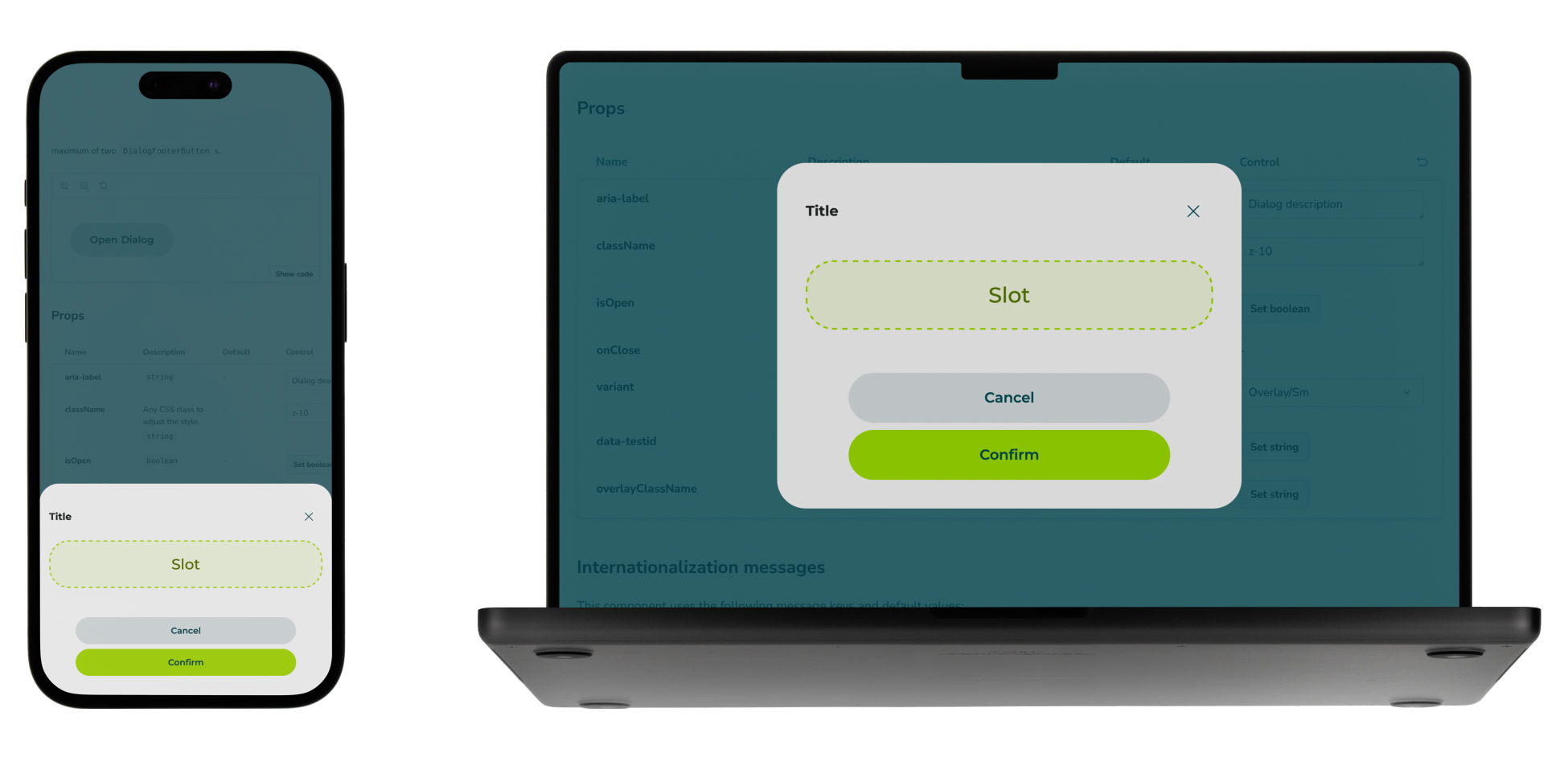
Consider the layout of a dialog component. For some dialogs, it’s important that the dialog is centered in an overlay on both mobile and desktop views. A typical example would be a confirmation dialog with a title, a message, and two buttons (e.g., 'Cancel' and 'Confirm') at the bottom. This type of layout should remain consistent across different screen sizes.
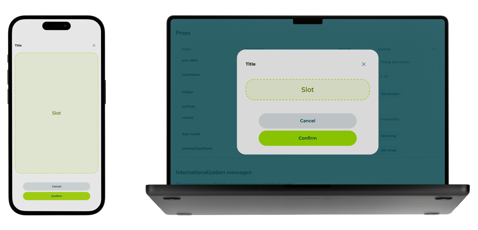
However, in some cases, we might need different layouts for mobile and desktop. For instance, if the content in the dialog is too long to fit comfortably on a mobile screen, a full-screen dialog may be the best option. But on desktop, the overlay dialog centered on the screen might still be appropriate.
In such cases, it would be cumbersome for the developer to manage the layout logic manually. They’d either have to add logic to switch between layouts based on the current screen size or create two different dialogs that share the same content, rendering the correct one based on the screen size. While the latter approach might work, hiding the unused dialog via CSS won’t prevent the component from being rendered in the DOM, potentially leading to performance issues or unexpected side effects.
The Need for Responsive Props
To address these challenges, we developed responsive props. This allows developers to easily define different values for properties based on the screen size, simplifying the process of managing layout variations across devices. By introducing responsive props, we provide a more flexible and streamlined approach for developers to handle different screen sizes without resorting to complex logic or performance pitfalls.
Let's take a look at an example from the perspective of a developer integrating a Dialog component. In this scenario, we want the dialog to use a centered overlay layout on larger screens but switch to a full-screen layout on smaller screens. With responsive props, we simplify this process by allowing the variant prop to accept an object where the keys represent breakpoints and the values define the corresponding styles:
1<Dialog variant={{
2  default: 'fullscreen',
3  sm: 'overlay',
4}}>...</Dialog>
5
Here’s how it works:
default: Defines the default variant (for mobile-first design, this is typically the smallest screen size).sm: Overrides the variant when the screen size reaches the sm (small) breakpoint.
To further illustrate the usage of responsive props, here are some additional examples of how they can be applied.
1{/* Same variant for all breakpoints */}
2<Dialog variant="fullscreen">...</Dialog>
3
4{/* Same variant for the default breakpoint and up until the md breakpoint */}
5<Dialog variant={{
6  default: 'fullscreen',
7  md: 'overlay',
8}}>...</Dialog>
9
10{/* Different variants for every breakpoint */}
11<Dialog variant={{
12  default: 'fullscreen',
13  sm: 'overlay',
14  md: 'fullscreen',
15}}>...</Dialog>
16
Under the Hood: How Responsive Props Work
To implement responsive props, we created a helper hook that resolves the correct value based on the current screen size. This hook returns a mapped configuration of breakpoints and their corresponding values, which the component can then use for styling.
1type DialogVariant = 'overlay' | 'fullscreen';
2type Breakpoint = 'sm' | 'md';
3
4export function Dialog({
5   variant = 'overlay'
6 }: { variant?: DialogVariant | ResponsiveConfig<DialogVariant> }): ReactElement {
7  const variantConfig = useCompleteResponsiveConfig(variant)
8
9  return <div
10    className={classNames(
11      variantConfig['default'] === 'overlay'
12        ? 'pt-6 ...' // Styles for overlay variant on mobile
13        : 'p-0 ...', // Styles for fullscreen variant on mobile
14      variantConfig['sm'] === 'overlay'
15        ? 'sm:p-8 ...' // Styles for overlay variant on tablet
16        : 'sm:p-0 ...', // Styles for fullscreen variant on tablet
17      variantConfig['md'] === 'overlay'
18        ? 'md:p-8 ...' // Styles for overlay variant on desktop
19        : 'md:p-0 ...', // Styles for fullscreen variant on desktop
20    )}
21  >
22    ...
23  </div>
24}
25
The useCompleteResponsiveConfig hook ensures that if a breakpoint-specific value isn't provided, it falls back to the previous available value.
1export type ResponsiveConfig<T> = {
2  default: T
3} & Partial<Record<Breakpoint, T>>
4
5export type CompleteResponsiveConfig<T> = {
6  default: T
7} & Record<Breakpoint, T>
8
9export function useCompleteResponsiveConfig<T>(
10  config: T | ResponsiveConfig<T>,
11) {
12  return useMemo(
13    () => {
14      const isResponsive = isResponsiveConfig(config)
15
16      const configDefault = isResponsive ? config['default'] : config
17      const configSm = (isResponsive ? config['sm'] : undefined) ?? configDefault
18      const configMd = (isResponsive ? config['md'] : undefined) ?? configSm
19
20      return {
21        default: configDefault,
22        sm: configSm,
23        md: configMd,
24      }
25    },
26    [JSON.stringify(config)],
27  )
28}
29
30export function isResponsiveConfig<T>(
31  data: T | ResponsiveConfig<T>,
32): data is ResponsiveConfig<T> {
33  return (
34    typeof data === 'object' &&
35    data !== null &&
36    ('default' in data || Object.keys(Breakpoint).some((key) => key in data))
37  )
38}
39
Conclusion
Handling responsiveness in a component library can quickly become complex, especially when dealing with compound components that require different styles across various screen sizes. Instead of relying on manual media query logic or cumbersome workarounds, responsive props provide a more elegant and developer-friendly solution.